Monday, 16 December 2013

Photoshop Challenge!


My Photoshop task was to create a brand new artist. I was to mix 50 Cent & Susan Boyle. To do so I started of with a normal image of 50 Cent. I enlarged the image so the sides were cut off and the image was easier to create. Next I got the 'Magic Lasso' tool and circle 50 Cents face so a blank shape was left open. I made sure to leave the cap and watch in the image so it looked more realistic. For each layer, I had to "Rasterize" so each layer was able to be transformed into what I wanted.


Next I added the left image of Susan Boyle into the photoshop. I closed all the other layers so that Susan Boyle was the only layer left. Next again I 'Magic Lasso' her face out of the frame but instead of deleting her face I right clicked and selected 'Select Inverse' so that I was able to delete the areas around her face but her face was left alone on the white background. After making each layer compatible with each other, I carefully moved Susan Boyle's face into the 50 Cent body frame so the image became one person.

After playing around with the layers to try and make it the way I intended, the image eventually turned out like this....

Monday, 2 December 2013

Magazine Terminology Overview.


In this blog I will talk and explain about the different things which describes magazines.


  • MASTHEAD - A Masthead is the title of the magazine. The masthead is usually in the top corner of the magazine and will be easily visible to see. It is one of a few things which is on the magazine every issue it releases. For example - Q, Vibe, NME, KERRANG, etc.
  • MAIN IMAGE - The Main Image is the largest image on the cover of a magazine. It is is the centre of the cover. Whoever the image is of is usually the main story of the magazine. Usually, whatever the genre of magazine it is, the main image will most of the time be an artist from that specific genre. For example - Q=Cheryl Cole, Vibe=Eminem, NME=Foo Fighters KERRANG=Biffy Clyro, 
  • BANNER - The Banner is a rectangle that spreads from the left to right side at the top. It is only thin but usually it is a different colour from the house colour of the magazine. It could be used to show a group of different stories or it is used to show one interesting story inside the magazine but is not used as the main Headline on the cover. A Banner is not always used on a cover of a magazine. For Example - Q with Cheryl Cole has not got a Banner. Vibe with Eminem has a Banner with different little stories on. NME with Foo Fighters on has a banner which shows a more important story than the main image. KERRANGE with Biffy Clyro shows a chance of winning a ticket for a top known festival. 
  • SLOGAN - A slogan is on most genres of magazines. If so it is on every issue released of that genre. It tells us something about the magazine. Some genres of magazines don't have a Slogan. For example Q="THE UK'S BIGGEST MUSIC MAGAZINE". Vibe="THE REAL RAP ISSUE". NME="NEW MUSICAL EXPRESS". KERRANG does not have a Slogan.


Voki Introduction.

Thursday, 28 November 2013

College Magazine Contents Page!

Here on the Contents page I used a house style by having the background as Brown.

To start I added 3 Purple circles and placed them down the left hand side. I added Page numbers inside the circles but made it yellow to stand out  over the purple circle background.

With each page number I added a short sentence next to each just to briefly explain what to see inside.

After this I added a self taken class image which shows 3 people working in a relaxed way. This dark image is moved over the text then moved the layers so the text is visible upon the image. The BLACK text was not clear over the dark image so like the page numbers, I created the text to be yellow over the image but I made it BOLD to look a little different. To add a little extra I again like the cover added the red + to tell what the reader could miss out on if enrolling in a different school. To finish, adding a new layer and simply adding the title "CONTENTS." BOLD yellow over the BROWN BACKGROUND.

Collage Magazine Cover!

I created a very basic collage magazine called "THE HEENAN LIFE" to try improve my photoshop skills. First I started with a starter layer named 'Background'. I changed the plain starter white layer background to brown.

Next I added a new layer for text. I drew out the text box and wrote "THE HEENAN LIFE". Then moved it towards the top. I glanced at the straight title and immediately thought that with nothing else it was plain. I Clicked free transform and and slanted the text box to get a leaning effect. I was happy with this change.

I created a circle and changed it to purple. Then added a text box and typed in "Teams to join, Areas to study, Places to relax" in yellow writing so it would stand out over the purple background circle. I tilted the writing so it was different to the bottom of the magazine. Next in a larger size of text I wrote "PLUS" in yellow so again it stood out over the purple. I created a "+" in red and made it a little bit bigger than the "PLUS" writing so it would stand out but instead changed it to red.

After this I inserted the main image which was of Tom Whittaker on the Apple Mac doing work. I simple square picture was not appealing so i drew a dircle around it, clicked select inverse and then deleted Tom's surroundings. Then I placed Tom and his work in the centre of the magazine.

Next, the same thing I done with the purple circle I done again but instead made a rectangle. I drew a text box over the purple rectangle and wrote what the magazine includes inside. I changed the font to Pink so it was a little bit different over the purple backing.

Feminism in Hollyoaks

The male gaze can happen pretty much everywhere. Not just in the music industry but even in Hollyoaks. In the clip below is a collection of scenes to show how the male gaze is inflected in just one episode. It is focused on the character Mitzeee Minniver's and her first ever entrance to her start of Hollyoaks.


The first clip is a low angle shot of Mitzeee walking down the street with a short tight dress on turning the peoples heads around her to gaze at her. Even one woman looks her up and down. Eventually her dress starts to pull up about half way through the scene so she sexually pulls it down in a way that isn't needed. Along with the people around staring at her, the camera pans behind her and follows her in a way to show that the audience now are also applying the male gaze by watching her walk.

After her gazing walk down the street, she quickly stops and turns at a shop, the camera slowly moves to her face as she takes her sunglasses off and reveals her face for the first time, she fixes her self up and answers a phone call, the camera is now a close up on her face so we can understand the type of person she is.

Throughout the rest of the scenes Mitzeee is with one or more men. She acts in a seducing way towards each one in each scene when eventually changes clip to her on stage with a water gun getting wet. In only the first scene there is music. The song is called "She wants to move" which straight away is exactlly what she's doing to get everyones attention.

Monday, 25 November 2013

Photoshop Introduction.

I used photoshop to show a basic understanding of how to use photoshop and to show my basic skills and understanding of it.


The above image was my starter image and my base background before I recreated the image to my own. I used two other images to replace Ben Johnston and James Johnston. Ben on the right and James on the left and kept Simon Neil in the centre.

I replaced James with Ed Sheeran on the right. I took out the background of Ed Sheerans image and blended the colour of the sky from Biffy Clyros image into the Ed Sheeran image. Hopefully this would help the image look more believable to the people who have seen the image for the first time. The image was now Simon Neil, James Johnston & Ed Sheeran.


                                                           Next, I done the same thing as I done with Ben and Ed but instead I put Liam Gallagher's body into the image to replace James Johnston on the left side of Simon Neil. After doing so I moved the layers around so that like the usual picture, Simon Neil was the main person at the front and centre of the image. With Liam's plain blue background I cropped it out and again blended Biffy Clyros background with Liam Gallagher so it looked more realistic. I duplicated the main image 4 times to get the background to look correct in order to class it as finished. It took me 7 layers to complete the task and about 2 hours to completely finish altogether.

This is the final image of my photoshop experiment....


Thursday, 31 October 2013

Ideology!

Ideology is the system of what we believe when we look at an image. When people look at an image and thinks different than what it is meant to would be to discriminate against them.


Here there are two images of my school building.
When hearing the word school you think of it to be safe, to the workers and kids who go here and so more people will join the school. The picture on the left shows the school to be unsafe and horrible. The sky is the main thing that connotes this because it is dark, grey, purple and a miserable colour mixed in sitting over the school.  Also the picture is taken from a low angle shot on a tilt, this may be used to maybe scare or intimidate children and pupils to going there.vIt shows that the building could be unsteady and unsecured.
The second image is different because it shows the school as a safe environment. Again like the first, the sky is the main feature that connotes the protection because it is blue and a more happy bright setting over the school instead of the sky on image 1. However on the first image the camera is low, on this one the angle is looking straight on to maybe show to was a secure and safe school.


Friday, 18 October 2013

Introduction to Photoshop.


This was not the first time I have used photoshop but this is the basic work. I have created the basic front of a newsletter or magazine. I have show where my taken pictures will be put in the yellow boxes once they have been taken. I am familiar with the basics of photoshop how how it works within the system. The only tools I used on this quick subject was the text, shadow and shape tools. I already knew how to use them all but shadow. This lesson I learned how to put the shadow effect with text to make it look more appealing.

Thursday, 17 October 2013

The History of Feminism.

Feminism has been around since 1945 when the second world war finished. As the war started all the men went of to fight for the country which left a huge gap of jobs open at home as because only the men would work as the woman and wives stayed home. But as the men were in war the woman took advantage of a man free world by taking there jobs and possibly doing them better than the men. They got awfully attached to each job until WW2 had finished. The men returned home to live there ordinary life as they did before the war but there was one problem. The woman had took control of every job and didn't want t go back to staying at home so took a stand to keep the jobs. All woman protested for there freedom and independence. They finally earned the respect the deserve and up until today have the equal level of authority as men do.

Music Magazine Questionnaire.

Analys of School Magazine.


The Cardinal bulletin is represented as a formal magazine because of the amount of writing on the front of the cover. The Cardinal Heenan Badge in the top left hand corner shows what the logo is. 

The image of the magazine graffiti shows that the school is more laid back than others and is artistic. The main graffiti points says "Respect", "Believe" & "Achieve" which is the main inspirational motto of the school.

On the left is a sub heading which says "Heads Message" This connotes that the head teacher of the school wants to speak out to who ever is reading the magazine and is represented as an interactive head of the school.

The bottom image shows a choir which helps readers see the type of things the school do with the pupils in different ways for them to enjoy being there. Already we are shown the Artistic and Musical side of the school before even looking inside the magazine. On two of the pictures the kids are dressed in a uniform. This connotes the school is tidy, well dressed, smart and very formal.

Semiotic Theory.

Semiotic Theory is the connection between a sign/object with the meaning behind it and a persons feelings/interpretations about a sign of the object. The sign is is the representation of the object where as the object its self is the thing interpreted. Interpretations are judged in three different ways such as "Perception", "Manipulation" & "Consummation".

Perception - when a person becomes currently aware of the sign.
Manipulation - when a person interprets the sign and decides how to respond to it in there own way.
Consummation - when a person responds to the sign its self.

Denotation and Connotation is based on a persons knowledge or on a persons opinions.

Denotation - is the exact meaning of the sign otherwise know as the definition which is in the dictionary of what a sign is. 
Connotation - is a persons personal opinion and view of what the sign is and what they think it is actually used for.

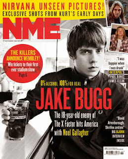
I have chosen this cover of NME magazine of Jake Bugg bug as there are recognisable expressions of this cover. The Denotation of this image is that Jake is sitting at a bar with a drink. However the connotation is that Jake Bugg is still a young adult as it says he is 18 which shows he is just about legal to have the drink in his hands even though it is not an alcoholic as he says "0% ALCOHOL, 100% FOR REAL" another connotation is that he is pulling a straight face to show he doesn't mess about and is serious about what he does in the music world. He's showing real passion towards music and his passion job. This is one explanation of why he has 0% Alcohol.


Applying Feminism!

Feminism in a music magazine is all about the main image on the front and how they are show as as an artist or weather they are coming across for the woman's body's.  They are shown to look attractive to give off a successful magazine.


Men are different than women on the covers because with men they show more of the musical side of them and do not care about the attractive side of them.

Woman are seen as housewives providing help and support for men because men refer to women as a sex object. This is a social system where the male has a higher class status over women. Media suggests that this is true and makes there authority higher as women are not show for there talent. They suggest that there status is higher and portray there roles over woman. On the cover above there are no signs of music. Cheryl Cole has no other purpose on the cover but to show her sexual side.


Beyond woman being treated as sex objects,  the image above of Beth Ditto lead singer of Gossip feels the need to show of her body on the front of the NME magazine to prove that not all woman are put on magazines to be seen as sex objects but are put on for there talent and to change the feelings of feminists opinions and views towards woman today. She believes that you don't have to look attractive to be on the cover of a music magazine.


On the cover above is Biffy Clyro, we immediately show our attention to Simon Neil (the middle main singer/guitarist) hugging the guitar. This shows his love for music and what he does. We see the group together with the guitar where as on the Cheryl Cole cover at the top we are focused on her beauty and attraction, not on her musical talent!

Thursday, 26 September 2013

Audience Research Methods.


Two ways to gather research are Qualitative and Quantitative.

Qualitative.

Qualitative research is based on numbers and mostly based with facts and real stories and experiences which have happened around the world.

I would use qualitative research if i was looking on finding facts of a specific story or anything which i needed real factorial research.

Quantitive.

Quantitive research is mostly based on a personal response and feeing. It tends to go into more detail than qualitative research and is based on a persons opinion more than facts and real events.

If I wanted to create something which was not based on on complete facts and was able to use research on peoples opinions and feelings then I would use the quantitive research method. 


Also two other ways of data is Primary data and Secondary data.

Primary

Primary data is where you collect the data yourself and gather it into a document together. One easy way to collect information is to create a social questionnaire for other people to answer and share there thoughts.

Secondary

Secondary data is where you gather information for an already given profile of information. The questionnaire has already been created for you to use and take the information from it.


Thursday, 19 September 2013

What is a Music Magazine?

In this blog I will mostly be discussing what a music magazine is and the purpose of a magazine. Also a brief paragraph about The first ever music magazine and a fact about that. Next a comparison about magazines and online music websites.


A music magazine is a way to learn about music for people who do not listen to the radio or who does not go online to read or learn about bands/artists.

Each magazine has its own genre of music it represents. Genre means the type of music that artists and bands do - Rock, Indie, Pop, Singer song-writer, Folk, Rap, House. My preferred genres are Indie Rock and Singer song writer.

The very first music magazine was "Banjo Mandolin Guitar magazine" created in the UK, founded in 1903 by Mr Clifford Essex. The magazine is also known as "BMG".

The most popular music magazine in the UK at the moment is "Q". It calls itself "The Worlds Greatest Music Magazine". Less music magazines are being sold each year because more people find it easier to read magazines online. The future of music magazines is not looking good for entertainment use.

Music magazine print are different than music magazine websites. In my opinion the online magazine website is better because it can be updated more frequent than the print. If something happens which is important to the music world, you can go straight online and read about it straight away where as if you prefer reading the print magazines you would have to wait until the next week/month when the next magazine has been released to purchase.

Friday, 6 September 2013

Introduction to my Blog.

Hello and welcome to my blog!

As a part of my AS Media Study A-Level I will have to keep a blog.

In this blog you will find my planning throughout the course and the basic instructions for each post. My evaluation for certain more important posts. Also my research, planning and brief evaluation throughout the rest of the year.

To support the research I will provide videos and images in my blog to help understand more about what i am talking about and what point I am getting across.

In this blog I will be creating a music magazine.

The types of music magazine I have chosen to research and study is Indie Rock and Singer songwriter. I have chosen this because I mostly listen to these two genres. Like Ed Sheeran and Biffy Clyro. I will be looking mostly at Q magazine as this magazine is most closest to what I need. I have experience and have produced work on Adobe documents and may be able to post the least of one blog a week.